Under Kak Kenduri

Quick Reference
Every locked value in one place — if a decision is not here, it genuinely is not locked yet.
| Legal name | Kak Kenduri Sdn Bhd |
| Name in copy | Kak Kenduri — capital K, two words. Never “KakKenduri”, never “KK”. |
| Wordmark | Lowercase kakkenduri — Poppins ExtraBold 800, navy kak + orange kenduri |
| Tagline | Semua Keperluan Majlis Dalam Satu Tempat. BM only, never translated |
| Primary | Deep Navy #003B78 · 60% |
| Surface | Warm Cream #FFF7EF · 25% |
| Accent | Celebration Orange #FF6600 · 10% — fill only |
| Text orange | #993D00 — the only orange that may carry a letterform |
| Booking CTA | WhatsApp #25D366 + white label. Primary weight, never a footer link |
| Display font | Poppins 600 / 700 / 800 — wordmark always 800 |
| Body font | Inter 400 / 500 / 600 |
| Radius | 8px button · 12px card · 999px pill |
| Easing | cubic-bezier(0.22, 1, 0.36, 1) · 220ms |
| Voice | Mesra · Profesional · Dipercayai · Bersemangat |
| Service pillars | Lengkap · Berkualiti · Pantas · Profesional · Mesra — fixed order, never translated |
| Languages | BM · EN · 中文 — one per page |
| One colour | Solid navy #003B78 |
break the brand.
— Orange text on cream, at any size.
— Gradients on buttons, text or the wordmark.
— A cream label on an orange fill.
— An uppercase or recoloured wordmark.
The kit, downloadable
Fonts, the wordmark in every variant, the balloon, the twelve icons and tokens.css — one zip. The icons ship twice, drawn for a light ground and for a dark one, because a mark drawn in the primary disappears on the primary.
Brand Architecture
One brand, two front doors: Kak Kenduri takes on the whole majlis, sewakerusimeja.com.my just the chairs and tables.

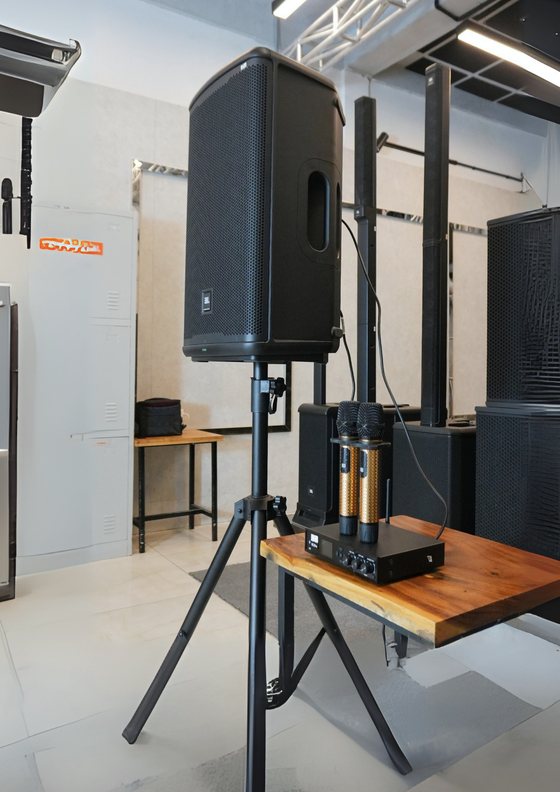
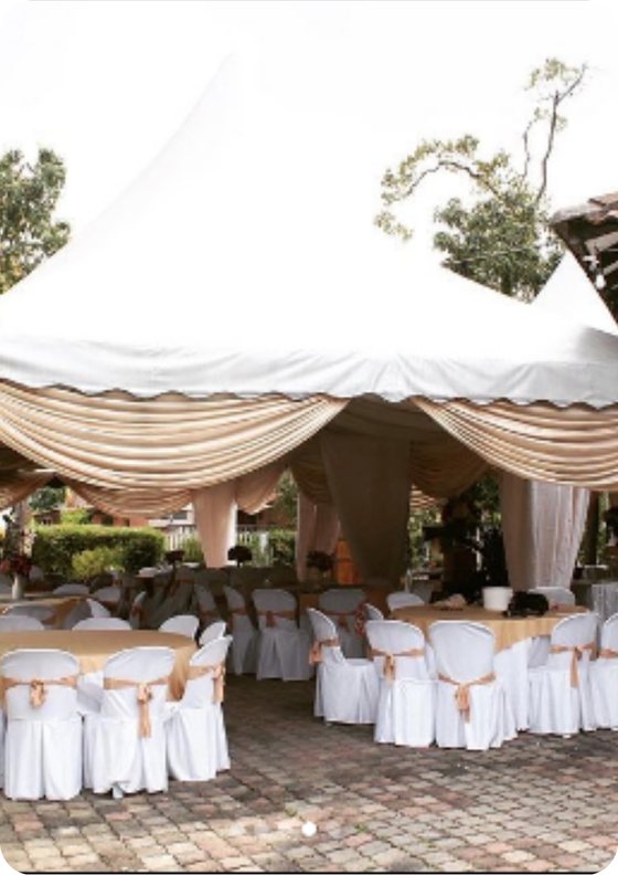
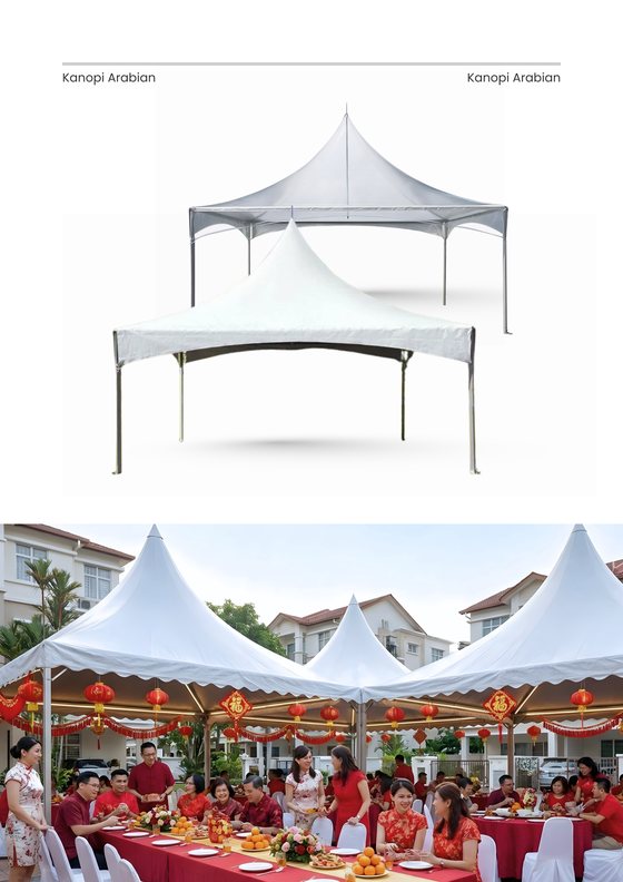
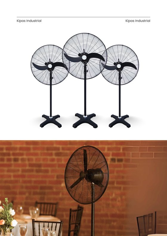
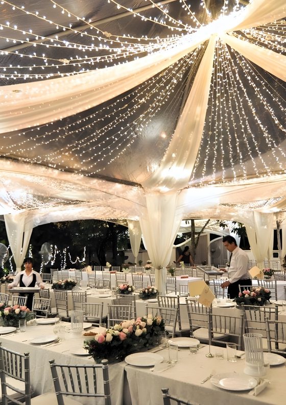
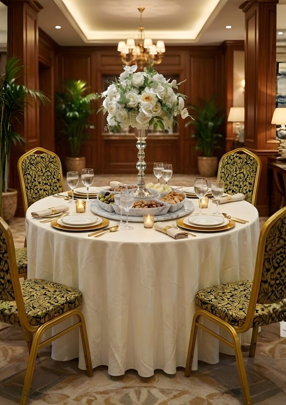
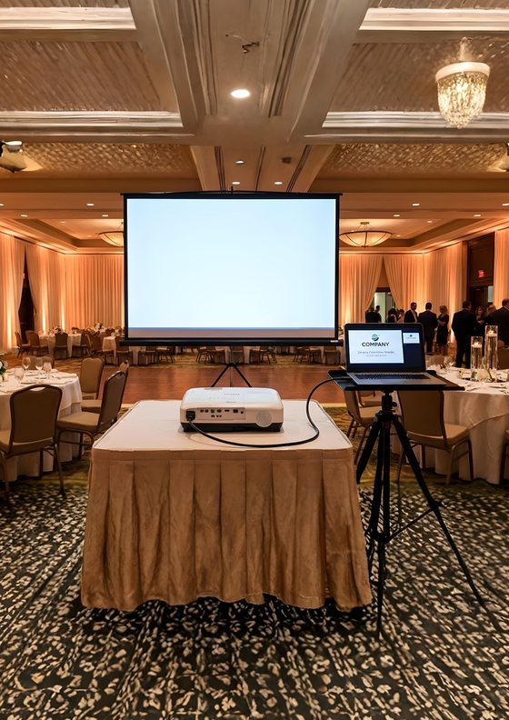
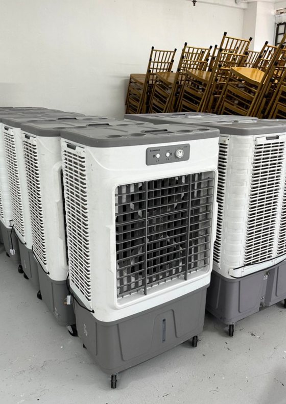
Everything a majlis needs: kerusi, meja, khemah, sistem bunyi, pentas, karaoke, lori dan krew. Booked over WhatsApp.
Audience. Event organisers · families · corporate · community

Chairs and tables, booked without having to ask anyone. Highest volume, fastest checkout, price right there on the page.
Audience. DIY hosts who only need chairs and tables
| kakkenduri.com.my | sewakerusimeja.com.my | |
|---|---|---|
| Wordmark | Master, balloon above the final i | Same master, plus the sub-line lockup |
| Palette | Navy 60 · cream 25 · orange 10 | Identical — no separate palette |
| Typefaces | Poppins + Inter | Identical |
| Sub-line | None | sewakerusimeja.com.my, Poppins 700 |
| Scope | Everything we rent | Chairs and tables only |
| Pricing | Quoted per event | Published list price, from RM3 |
| Booking |
The sub-brand is a channel, not a second brand. It never gets its own colours, its own typeface or its own mark. If a customer needs a canopy or a sound system, the answer is the parent brand — the sub-brand exists to make the highest-volume request bookable in five minutes.
Logo & Wordmark
All lowercase, navy kak, orange kenduri — that two-colour split is why the name reads at 40 metres and at 16 pixels.
The wordmark ships as locked path data, so no font is needed at render time and it can never drift to a fallback typeface. Place the SVG — never redraw it.


| 1 | Lowercase only. Never KAKKENDURI inside the wordmark. In running copy the brand is “Kak Kenduri”. |
| 2 | The colour split is locked. Navy kak + orange kenduri. Never swap them. |
| 3 | Poppins ExtraBold 800 only. Never lighter, heavier or substituted. |
| 4 | The balloon is optional. Keep it for hero, lorry, canopy, social. Drop it for favicons under 24px, embroidery and invoice headers. |
| 5 | Balloon geometry is fixed. ~6° right tilt, body 1.1× cap-height, string anchored on the dot of the final i. |
Clear space equals the height of the balloon on every side. Nothing enters it — no text, no rules, no photo edge, no second logo. Double it on a canopy or lorry panel.
| Screen, balloon | 120px |
| Screen, no balloon | 88px |
| Print, balloon | 32mm |
| Under 24px | Balloon only |
Under 24px the string comes off — at that size it turns to mush, and the balloon reads better without it.
Full colour on cream, white or any light neutral. The dark variant the moment it sits on navy, on a photograph, or on signage.
Never on orange — the kenduri half simply vanishes into it. Never stretch, squash, rotate, recolour or add effects.


Favicons, app icons, social avatars, embroidery — anywhere the name is already on show and the balloon can speak for it.


Retired in v2.0. with-balloon-* and with-tagline-* were byte-identical duplicates — the tagline files contained no tagline. A real tagline lockup is still outstanding; until it ships, set the tagline as live Poppins 700 text under the wordmark.
Color
Five colours, solid, no gradients — navy and orange already carry the contrast. Click any block to copy its hex.
Five colours, nothing else. Navy carries structure and authority, cream carries the warmth of a majlis, and orange is the celebration — used at 10%, never as the surface.
The locked split. If a layout feels orange-heavy, trust that feeling — it is out of spec.
All four are light fills — every one takes a charcoal label. WhatsApp green is reserved for the booking CTA and always ships with the WhatsApp glyph.
never a letterform.
#FF6600 on cream is 2.77:1. That fails WCAG AA for body text and for large text — there is no size at which orange text on cream is acceptable.
| Pairing | Sample | Measured | Body | Large | In the kit |
|---|---|---|---|---|---|
| Navy on Cream | Kerusi & meja | 10.44:1 | ✓ | ✓ | Yes |
| Charcoal on Cream | Kerusi & meja | 16.41:1 | ✓ | ✓ | Yes |
| Cream on Navy | Kerusi & meja | 10.44:1 | ✓ | ✓ | Yes |
| Text orange on Cream | Kerusi & meja | 6.55:1 | ✓ | ✓ | Yes |
| Orange on Cream | Kerusi & meja | 2.77:1 | ✗ | ✗ | No |
| Orange on Navy | Kerusi & meja | 3.77:1 | ✗ | ✗ | No |
| Charcoal on Orange | Tempah Sekarang | 5.93:1 | ✓ | ✓ | Yes |
| Cream on Orange | Tempah Sekarang | 2.77:1 | ✗ | ✗ | No |
| Charcoal on WhatsApp | Chat WhatsApp | 8.78:1 | ✗ | ✗ | No |
| Cream on WhatsApp | Chat WhatsApp | 1.87:1 | ✓ | ✓ | Yes |
| White on WhatsApp | Chat on WhatsApp | 1.98:1 | ✓ | ✓ | Yes |
Two separate questions.Measured is the computed contrast ratio — a fact, not a preference. AA wants 4.5:1 for body text and 3:1 for large. Body / Large / In the kit are what the identity permits. They disagree on four rows: orange is never a letterform however it measures, and the WhatsApp pill takes a light label although charcoal is the pairing that clears AA.
The v1.1 kit published a contrast table with four wrong rows — navy-on-cream listed as 12.4:1 (actually 10.44:1), orange-on-cream as 3.6:1 (actually 2.77:1).
It also shipped the Accent and WhatsApp buttons with cream labels. Accent now takes charcoal. The WhatsApp pill keeps a light label by brand decision: white by default #FFFFFF at 1.98:1, cream at 1.87:1. Both are below AA and both are deliberate — WhatsApp's own product uses a white label on this green, and matching it is what makes the button read as WhatsApp. A dark label is not used, even though charcoal measures 8.78:1. Recorded here so the trade-off is on the page rather than hidden.
One-colour reproduction — embroidery, engraving, single-channel print, stamps — is solid navy #003B78. Never orange.
Typography
Poppins when it has to be seen, Inter when it has to be read. Two families, six weights, nothing else.
ExtraBold 800 — wordmark, display, hero headlines. Bold 700 — section titles, sub-heads, button labels. SemiBold 600 — H3.
abcdefghijklmnopqrstuvwxyz
0123456789 RM · & · ✓
Regular 400 — body copy, invoices, quotations. Medium 500 and SemiBold 600 — UI labels, table emphasis, form labels.
abcdefghijklmnopqrstuvwxyz
0123456789 RM · & · ✓
| Role | Spec | Tracking | Sample |
|---|---|---|---|
| Display | Poppins 800 · 64 / 1.05 | −0.025em | Majlis |
| H1 | Poppins 700 · 48 / 1.05 | −0.02em | Heading 1 |
| H2 | Poppins 700 · 32 / 1.1 | −0.015em | Heading 2 |
| H3 | Poppins 600 · 22 / 1.2 | −0.01em | Heading 3 |
| Body | Inter 400 · 15 / 1.55 | 0 | Kerusi tiba jam 8 pagi. |
| Small | Inter 400 · 13 / 1.5 | 0 | Termasuk hantar & kutip. |
| Micro caps | Inter 700 · 11 · upper | 0.12em | Disahkan |
Poppins for anything that has to be noticed, Inter for anything that has to get out of the way. Never a third family.
Prices, quantities and invoice tables use Inter — its figures align in columns. Poppins numerals are for headline moments like RM 3,660 on a quote.
BM runs 15–20% longer than English, so design to the Malay string first. If it fits there, EN and 中文 will follow.
Voice
Write like a Kak who has seen a thousand majlis: warm first, exact second, and never overpromise.
Setiap majlis ada cerita.
Kami pastikan ceritanya menjadi.
Say kami, never “pihak syarikat”. Her name, not her booking ID. Warmth belongs in line one.
Specifics beat adjectives. Name the hour, the price, the headcount — never “we'll do our best”.
Tiada caj tersembunyi. Photos the moment we deliver. Receipt in her hand within the hour.
“Boleh!” beats “kami akan cuba”. This is the biggest day this family will host all year — sound glad to be in it.
| Principle | Say this | Not this |
|---|---|---|
| Mesra | ✓ Say Selamat datang, Kak Yana — tempahan untuk 5 Mei sudah disahkan. | ✗ Not Customer YANA, Booking ID #4421 has been confirmed. |
| Profesional | ✓ Say Kerusi tiba jam 8 pagi, siap pasang 9 pagi. Krew berseragam, 4 orang. | ✗ Not Equipment will be delivered in the morning. |
| Dipercayai | ✓ Say Harga termasuk hantar, pasang dan kutip semula. Tiada caj tersembunyi. | ✗ Not *Subject to terms and conditions. |
| Bersemangat | ✓ Say Majlis kahwin 300 orang — kami pernah buat 500. Boleh! | ✗ Not We will do our best to accommodate your requirements. |
Language
One language per page — the toggle remembers the choice and opens in Bahasa Melayu, never English.
Segala keperluan majlis anda, siap tepat pada masa.
Kerusi, meja, khemah, sistem bunyi dan pentas — dihantar, dipasang dan dikutip semula oleh krew kami sendiri.
Everything your event needs, ready right on time.
Chairs, tables, tents, sound and stage — delivered, set up, and collected by our own crew.
宴会所需的一切,准时就绪。
椅子、桌子、帐篷、音响与舞台 —— 由我们的团队负责送货、安装与回收。
Active is a navy fill with a cream label; inactive is transparent. The choice is stored and respected on the next visit and on the server. When the locale is unknown, fall back to BM — not English.
| Locked term | Why it never changes |
|---|---|
kakkenduri | The wordmark. Always lowercase, always Poppins 800. |
| Kak Kenduri | The brand name in running copy — capital K, BM-style spacing. |
| “Semua Keperluan Majlis Dalam Satu Tempat.” | The tagline. It carries the promise in the customer's own language; translating it flattens it into a slogan. |
| Lengkap · Berkualiti · Pantas · Profesional · Mesra | The five service pillars. Fixed order, never sorted, never translated. |
| Kakak | How the brand refers to itself in service copy. No English equivalent keeps the warmth. |
Buttons
Every button below is live. WhatsApp carries full Primary weight because that is where the bookings come from.
| Variant | SM 32 | MD 40 | LG 48 | Label |
|---|---|---|---|---|
| Primary | #FFF7EF | |||
| Accent | #1A1A1A | |||
| Ghost | #003B78 | |||
| Destructive | #1A1A1A | |||
| #FFFFFF |
Label colours are not a style choice. Orange, danger, success and amber are light fills — they take a charcoal label. Navy takes a cream label. WhatsApp is the one exception: its pill takes a light label — white #FFFFFF by default, cream where the surrounding type is cream. Never charcoal or black on the green, whatever it measures. Where the ratio matters, carry the meaning outside the pill rather than darkening the label.
wraps. Ever.
.btn {display: inline-flex; align-items: center; justify-content: center; white-space: nowrap; flex-shrink: 0; border-radius: 8px;}.btn .ic { flex-shrink: 0; }Height, padding and icon size are all fixed px — never em — so a long Malay label can never compress the button or shrink its icon.
8px buttons and inputs · 12px cards, panels and modals · 999px chips, badges and pills.
Chips & Badges
Six variants: brand emphasis, pillar callouts, and the three states a booking can be in.
Uppercase, 10px, 0.12em tracking. Every status chip carries a dot, so the state survives a greyscale printer.
Inputs & Forms
One booking form does nearly all the work, usually one-handed on a phone — so the pattern never moves.
Tab into a field and you cannot miss it: 1px orange border, 3px ring. Labels sit above and stay put, and placeholders show a real Malaysian example — never “enter text”.
Iconography
Two collections: signature icons name what we rent, utility icons do the quiet interface work.
A signature icon gets exactly one orange element — the part that identifies it. Two, and it stops reading at 20px.
Status is never carried by colour by itself. Pair it with a label or a dot so it survives greyscale printing.
When a label already names the thing, mark the icon aria-hidden. Icon-only buttons carry an aria-label.
Pattern & Texture
Four patterns, one per surface, never two — a kenduri already supplies the colour and the movement.
1.5px orange dots, 45% opacity. Hero overlays, section backgrounds, invoice watermark at 6%.
1px navy lines, 10% opacity. Layout backgrounds, table zebra, dashboard canvas.
Varied sizes, never overlapping. Social banners, canopy panels, event backdrops.
3px navy bar with an orange first fifth. Divides sections on letterhead and quotations.
| Surface | Pattern | Notes |
|---|---|---|
| Website hero | Confetti dot | Masked to fade before the headline. Never behind body copy. |
| Invoice & quotation | Section rule | Under the letterhead block only. Confetti may sit at 6% as a watermark. |
| Social banner | Balloon scatter | On navy. Wordmark left, scatter right, nothing behind the text. |
| Lorry wrap | Balloon scatter | Large scale, 3–5 balloons per panel maximum. |
| Canopy skirt | Section rule | Repeated horizontally. Wordmark on the front entrance panel only. |
| Dashboard / app | Navy grid | Canvas background at 10% or lower. Never behind data tables. |
| Uniform | None | Navy polo, orange chest stripe, mono cream wordmark embroidered left chest. |
One pattern per surface. Confetti over grid, or scatter over confetti, reads as noise and destroys legibility at distance — which is where most of these surfaces are actually seen: across a hall, from a passing car, on a phone in bright sunlight.
Applications
Ten places the brand has to survive in daylight — across a field, off a lorry, on a phone.
Nurul AinaPengurus OperasiDalam Satu Tempat.
90 × 54mm trim, 3mm bleed, 5mm safe area. 310–350gsm uncoated.
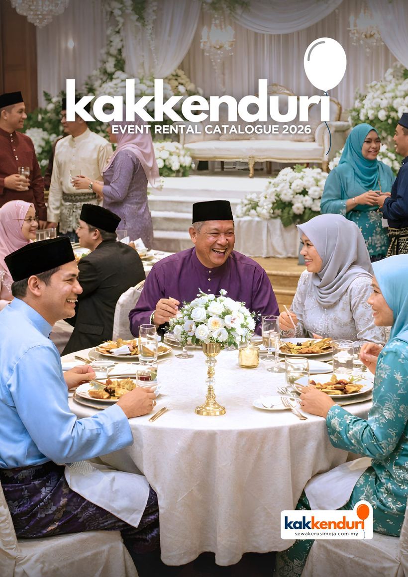
Twenty-four A4 pages of kerusi, meja, khemah and majlis packages, with prices.
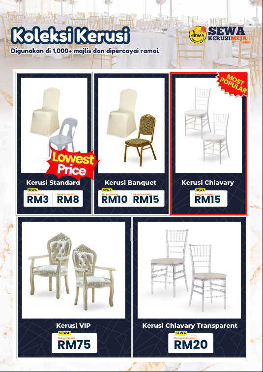
Build a product sheet: pick how many fit, drop the photos in, print to A4.
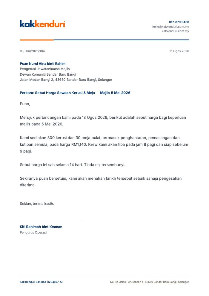
A4, 20mm margin, wordmark top-left, no balloon — a letter is not the place for it. The section rule sits under the letterhead only.
| Surface | Specification |
|---|---|
| Website | The brand website. Hero uses orange ambient wash + balloon scatter. |
| Dashboard / app | Fleet, bookings, calendar, invoices. |
| Invoice / quotation | Cream paper, navy header. Mono navy print fallback. |
| Letterhead | A4, 20mm margin, wordmark top-left. Branding repeats on page 2 onward. |
| Email signature | Brand block 480px wide, WhatsApp link inline. |
| Social avatar | 128 / 96 / 64px standalone balloon. |
| Lorry wrap | Wordmark + tagline + phone number. |
| Canopy / khemah | Wordmark on the front entrance panel. |
| Uniform | Mono cream wordmark embroidery on left chest. |
| Signage | Wordmark backlit, 8mm proud. |
| Name card | 90 × 54mm trim, 3mm bleed, 5mm safe area. 310–350gsm uncoated, matt lamination if coated. |
Most of these are read at distance. A lorry passes at 60km/h, a canopy is seen across a field, a uniform from three metres. When a surface is far away or moving, drop the balloon and the pattern before you drop the wordmark — the two-colour split is what stays legible.